
Colour does not arrive in a room by itself. It sits next to a wall, underneath a bowl, across from another fabric. What we see depends as much on those neighbours as on the colour we first selected.
Begin with the neighbours.
Start with a generous base. Canvas, natural timber and stone give stronger colours room to breathe. They also allow a woven edge, a painted surface or an abstract print to carry the emphasis.
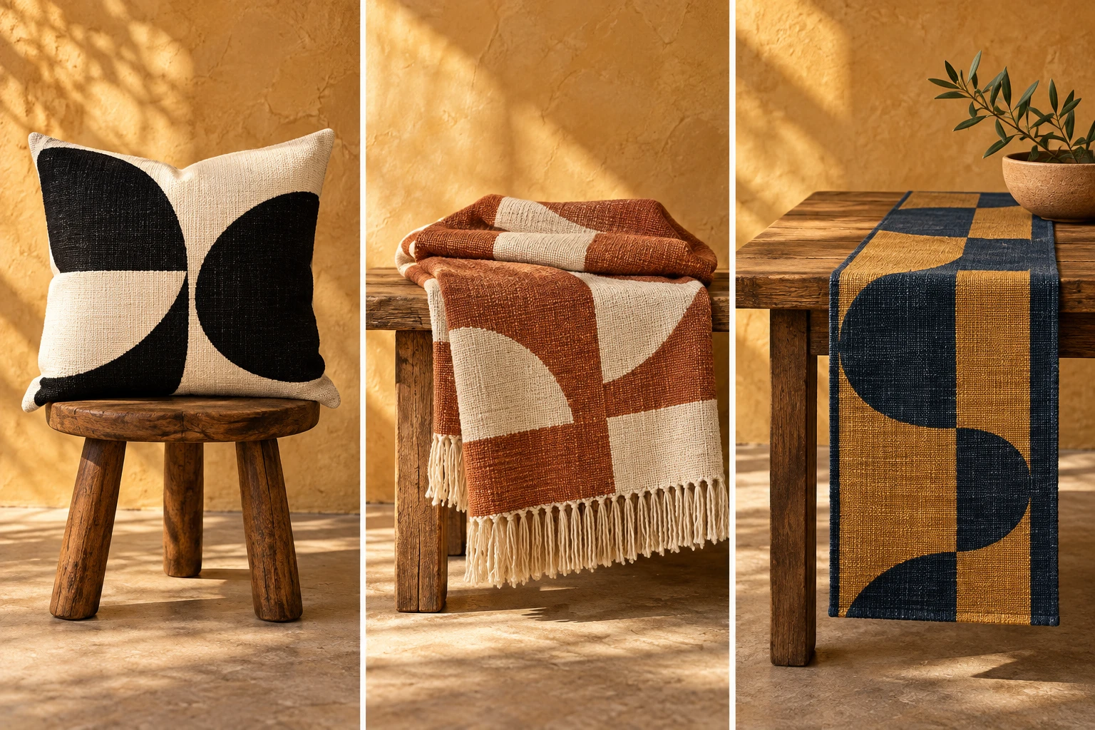
Then introduce a pair with a clear relationship. Terracotta and ochre share warmth, while indigo adds depth. Olive can bridge those two directions without making every object feel coordinated in the same way.
Repeat a colour at a different scale. A broad shape in a print can answer a small stripe in a textile. The repetition makes a connection; the change in proportion keeps the room from feeling rigid.
Texture changes the result. A flat patch of printed blue and an indigo weave do not reflect light alike. Layering both creates variation even when the palette is restrained.
Leave a little unexpected space. A room can feel connected without every piece matching. The most useful compositions allow individual objects to keep their own voice.